Harry Potter is a worldwide phenomenon, it made around 8 billion dollars in the worldwide box office and it is absolutely adored by fans. No other book series has had quite the outstanding success that Harry Potter has. Some have got close, for instance The Hunger Games, but none still have such cultural relevance nearly twenty years on.
The first book, Harry Potter and the Philosopher’s Stone, was published in 1997 and was a great success. Four years later the first film was released. It was also incredibly successful, making almost 1 billion dollars in the worldwide box office. It starred Daniel Radcliffe in the titular role and had many famous British actors in the wider cast.
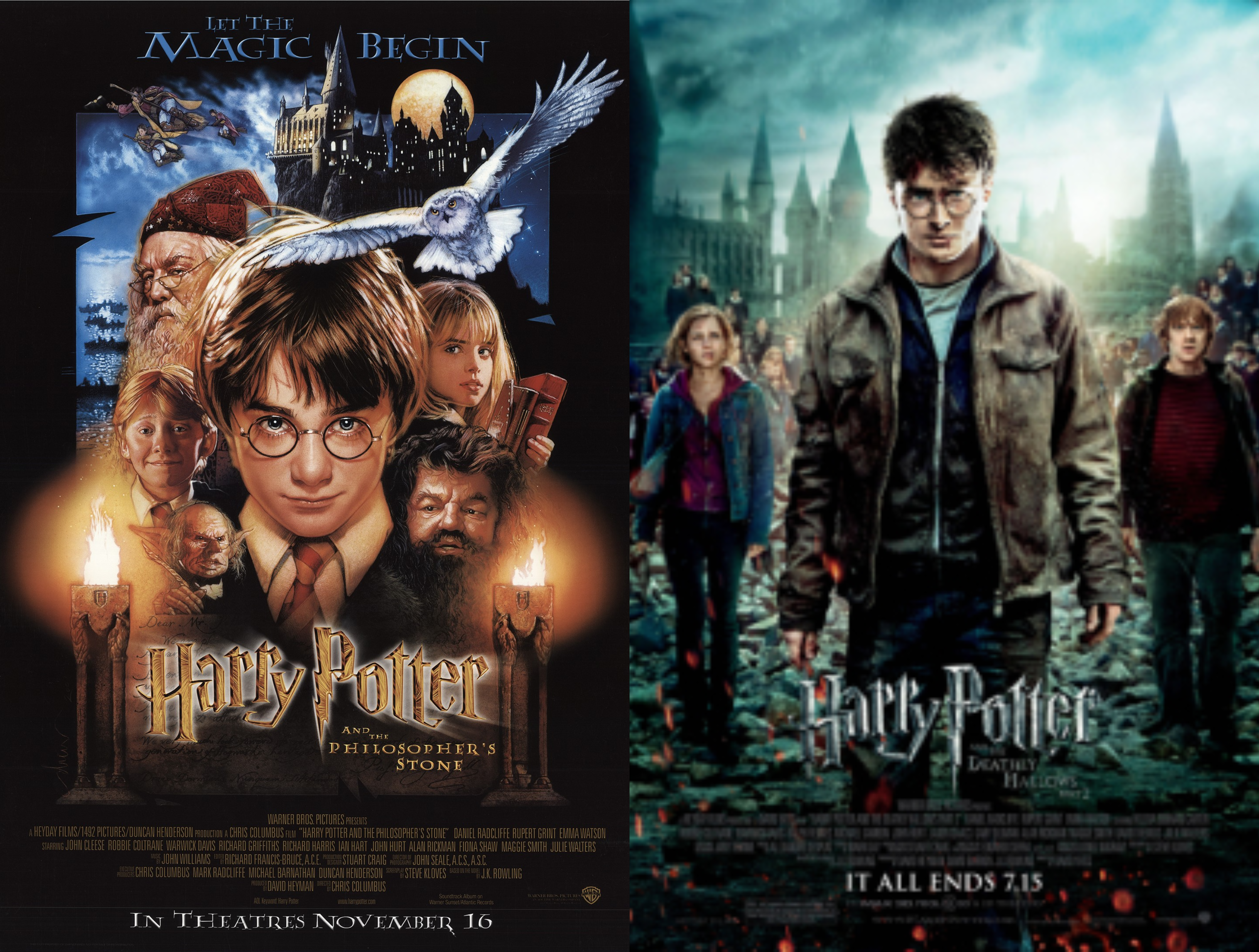
The movie posters for the first and second Harry Potter films were designed by Drew Struzan, these posters have a more artistic style that looks more original compared to the later posters that have a more generic film poster aesthetic.
The typeface that is used on the Harry Potter posters is not actually a font but rather a logo. It first appeared on the US copies of Harry Potter and the Philosopher’s Stone (or Sorcerer’s Stone seeing as we’re talking about the US editions) and it later became the branding for the film posters. The films were distributed by Warner Bros., an American company, so this could be why the logo from the US book covers was used to market the films. The lettering used for the logo doesn’t have a name and is owned by Warner Bros. so it is not available for public use. The style of lettering is so iconic to the Harry Potter series that you would be hard pressed to find a use for the font in any other setting without it being synonymous to the series, so it is unsurprising that it is not in the public domain. However, many people have created their own versions of this iconic lettering that is free for public use so there are alternatives out there.
The use of colours for the posters is very intriguing. For the first poster the use of warmer colours is a lot more prevalent compared to the later film posters. The Philosopher’s Stone poster uses many reds and oranges, possibly to be in keeping with the house colours of Gryffindor which are red and gold, and the title uses various shades of brown to create a mottled or tarnished gold. These combinations of colours could have been used to reflect Harry’s warmth and innocence in the first film as he hasn’t yet faced the hardships he experiences later on in the stories. To further reflect this idea the later film posters focus on a colder colour palette with colours such as green and blue. The title for the Deathly Hallows pt 2 is silver which adds to the feeling of coldness and despair, a theme that is key in the last film. The use of symbolic colour makes these film posters so successful.